SongKong Jaikoz

SongKong and Jaikoz Music Tagger Community Forum

Jaikoz User Interface Improvements

Results so far from the Jaikoz features/improvements poll What major feature/improvement would you most like to see in Jaikoz? have a clear leader with Update User Interface, so I have created this new topic for customers to discuss ideas for this time, all input very welcome

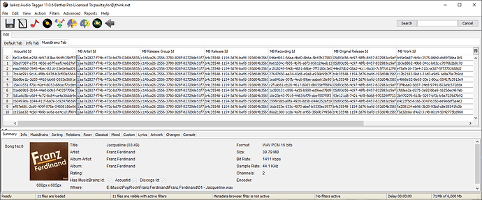
I have made a start, so I wanted to give preview on what I’m working on

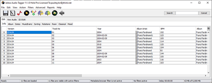
We now support having multiple metadata edit tabs this is solve the problem of endless right scrolling if you want to show alot of fields, instead you can setup multiple tabs and switch between them

and if you use the split screen view mode, that will have the same tabs

Getting this far was alot of work, but now working well. The idea is the default set of tabs will be similar to what the Detail panel shows

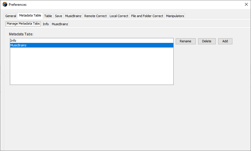
you’ll be able to amend the columns and tab names, but also create new tabs or delete existing ones

1 Like

Filters! Filters! Filters!

It would be very helpful, for example, to filter a column to show only the changed values.

Multiple filters are also welcome

Okay that sounds likes a good idea https://jthink.atlassian.net/browse/JAIKOZ-1356

Another option that comes to mind reading your previous post is to use tabs to create templates (for example there might be a “Roon” template where only tags that Roon uses are visible). Obviously, users must be given the opportunity to create and modify these templates.

An alternative at a “higher” level could be the creation of profiles.
Keeping the example of Roon, you could have a profile where, in addition to being visible only the fields used by Roon, also the data update settings of the fields (matching from musicbrainz, discogs, update fields, never update fields, classical settings, etc …) will have the Roon “focus”

So now have Metadata Tabs in Preferences so that users can edit the tabs, deciding on tab name and the columns that each tab displays, does this fulfill the template requirement ?

The idea of Profiles (like we have in SongKong) is something I would like to do at some point.

Good solution.

For the profiles, I agree that having them as Songkong would be optimal

Not sure if it’s been mentioned before or how difficult it would be, but a dark mode would be great. Using Jaikoz at night can be a bit bright.

We have done it on MacOS so should be able to do for Windows and Linux as well https://jthink.atlassian.net/browse/JAIKOZ-1354

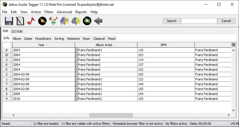
We have multi-column sorting working !

Still working on the rendering of table header but as you can see multi column sort working, in screenshot sorted by Year, Album Artist and then BPM.

1 Like

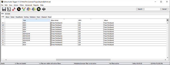
Now have Windows header renderer working with muti-sort column rendering

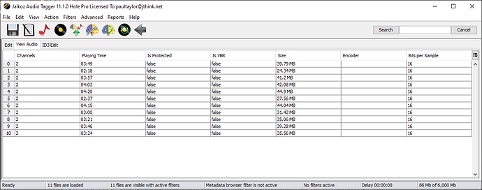
Have now moved the View Audio tab to the main edit window . So now you no longer need to enable the View/Show View Pane panel just to look at audio data

I have a question.

The Edit tab can now have configurable sub tabs and columns as you wish
We have not done this for the Audio tab (not many columns anyway so doesnt need multiple tabs) or the ID3 tab which is only valid for some audio formats and is not used that much by most users. But my question is this ?

Is there value in keeping Edit Metadata/View Audio and Edit ID3 Metadata as three different sections, or would it be better to merge the View Audio and Edit ID3 Metadata into the Edit Metadata tab, so that you can use mix and match and fully configure, but at the loss of some clarity ?

Maybe silly question…will you also provide a web interface like in SongKong?

No, the user interface would be very difficult to replicate in webbrowser. But I do intend to improve the web manual edit in SongKong so it is more powerful.

Thanks Paul, maybe I would use SongKong even more :smiley:

Excellent start Paul.

A more flexible copy and paste would be very useful allowing copying of partial contents of a cell and pasting over part of a cell.

Your multiple Tab selection idea is great, it will save lots of column shuffling! A horizontal highlight in the row with the cursor in it would also help greatly especially when working with compilations having different entries for every track.

Were you aware you can already click on field to edit and then copy part of the text and then paste just that part to another field, or did you mean something else.

That seems a good idea - https://jthink.atlassian.net/browse/JAIKOZ-1353

Hi Paul, If I select the whole field and right click, the copy and paste dialogue pops up and I can copy and paste the entire field. If I double click to edit the field and then select part of the text and right click, the copy and paste dialogue does not appear so I can’t find a way to copy the partial content of a field to paste. Have I missed something? Thanks Kevin

Right I see, I always use shortcuts key for copy and paste (Cntl-C, Cntl-V on Windows) and that works for me, but I see what you mean now, I could add a Copy/Paste popup menu for when you just have some text selected.- https://jthink.atlassian.net/browse/JAIKOZ-1352

1 Like

What really bothers me about the interface is that if you have the View Window and the Edit Window open and you have sorted a column in the Edit Window, for example: Title column, so that the View Window and the Edit Window have the same sort order of this column, an Undo (CTRL + Z) in any column (except the sorted one) resets the sort order in the View Window. Only a new sorting of the column to be sorted in the Edit Window restores the original state.
I think also with other changes in the Edit Window (not only with UNDO) a loss of the sort order in the View Window occurs.

This is a very old bug for which I believe there is a bug number, but it has never been fixed. Paul you had mentioned this bug as a problem with Java environment.

I believe that is all now fixed, as part of implementing multi column sort I had to update various libraries that broke things and redo all sorting and view/edit synchronization.