I made a start with adding the hyperlinks, but Im not sure if a bit confusing having yellow hyperlinks for the inconsistencies ones, and blue for the others, what are your thoughts?
I made a start with adding the hyperlinks, but Im not sure if a bit confusing having yellow hyperlinks for the inconsistencies ones, and blue for the others, what are your thoughts?
I don’t think it’s confusing at all… think of it from a noobs pov: first couple runs and everything is clean and blue. Run three and suddenly there’s a bright yellow tab up top. It will catch their eye for sure and force them to investigate.
However, I do think it’s a bit hard to read the yellow text.
I think doing a mock up with BACKGROUND set to yellow and the text set to the blue is something to try. It’s probably not going to look beautiful as a color combo, but the bottom line here is calling attention to those tabs, which I think a yellow background will do better than text color being yellow since it will be easier to read and look like it’s highlighted rather than maybe a UI glitch.
That said I think any visual indicator is an improvement, so I’m stoked to see this version!
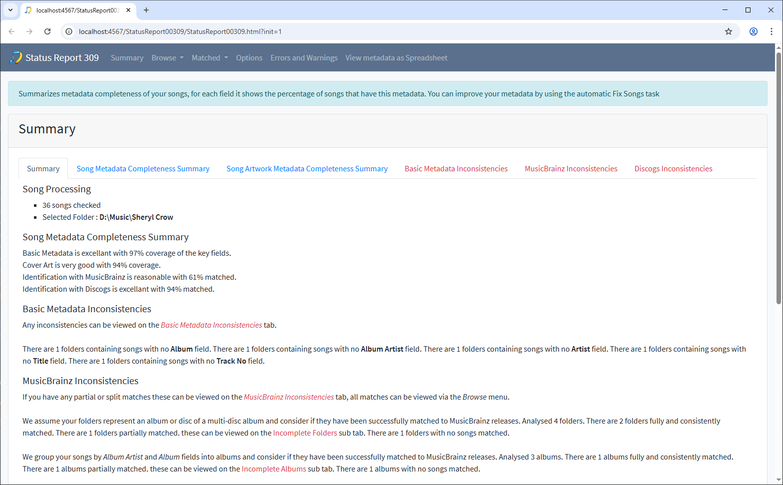
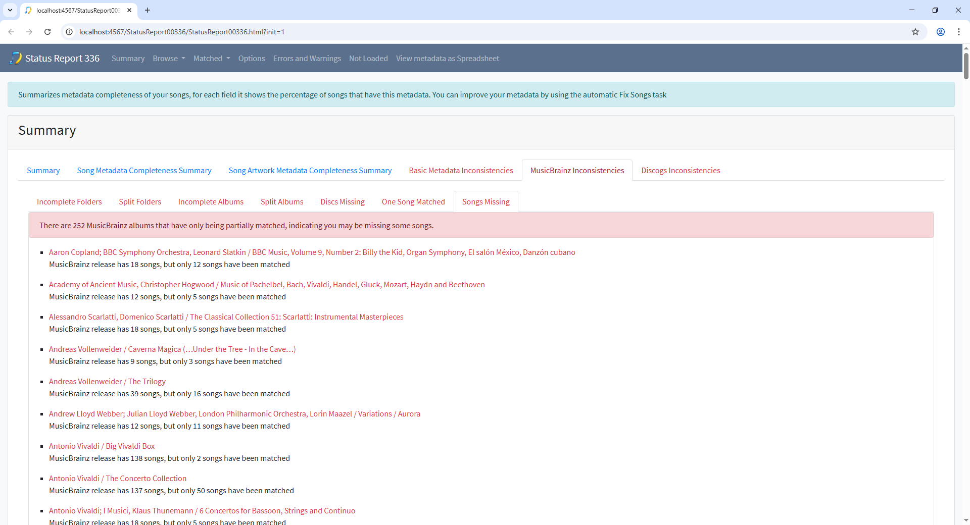
This is the summary tab, not an error tab so doesn’t make sense to me to make this tab yellow. This is a version using red, that at least would grab the attention as red usually indicates an issue
More likely to be the other way, first time you run anything it finds errors with what you started with , that get fixed as you use SongKong more.
Yellow seems rather unusual to me;
I would say:
red - error indicator
green - everything OK
Regards
Klaus
The idea comes from Bootstrap where yellow indicates a warning since these are not necessarily errors just flagged as potential issues
But since Yellow is not very clear against White and meaning of Red is better understood I think I will use Red.
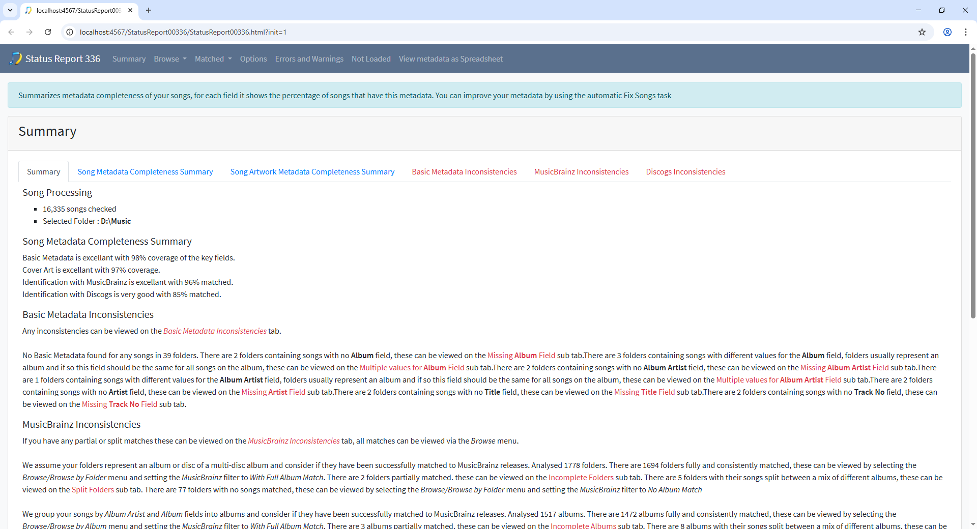
This is what we have now, probably final version
I’m 100% fine with this. Red is great, it’s readable, and most importantly it says “hey look at me there’s something going on that needs your attention” which is exactly what the summary needed. Bravo!
I’m soooo happy to see this implemented!
Now released