SongKong Jaikoz

SongKong and Jaikoz Music Tagger Community Forum

Jaikoz User Interface Improvements

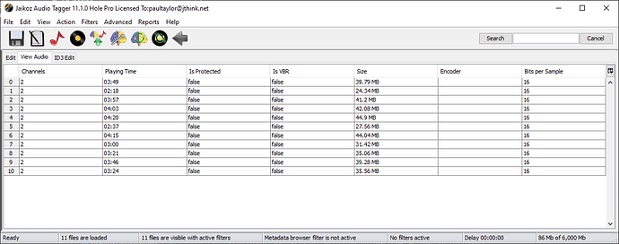
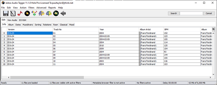
Have now moved the View Audio tab to the main edit window . So now you no longer need to enable the View/Show View Pane panel just to look at audio data

I have a question.

The Edit tab can now have configurable sub tabs and columns as you wish
We have not done this for the Audio tab (not many columns anyway so doesnt need multiple tabs) or the ID3 tab which is only valid for some audio formats and is not used that much by most users. But my question is this ?

Is there value in keeping Edit Metadata/View Audio and Edit ID3 Metadata as three different sections, or would it be better to merge the View Audio and Edit ID3 Metadata into the Edit Metadata tab, so that you can use mix and match and fully configure, but at the loss of some clarity ?
Maybe silly question…will you also provide a web interface like in SongKong?

No, the user interface would be very difficult to replicate in webbrowser. But I do intend to improve the web manual edit in SongKong so it is more powerful.

Thanks Paul, maybe I would use SongKong even more :smiley:

Excellent start Paul.

A more flexible copy and paste would be very useful allowing copying of partial contents of a cell and pasting over part of a cell.

Your multiple Tab selection idea is great, it will save lots of column shuffling! A horizontal highlight in the row with the cursor in it would also help greatly especially when working with compilations having different entries for every track.

Were you aware you can already click on field to edit and then copy part of the text and then paste just that part to another field, or did you mean something else.

That seems a good idea - https://jthink.atlassian.net/browse/JAIKOZ-1353

Hi Paul, If I select the whole field and right click, the copy and paste dialogue pops up and I can copy and paste the entire field. If I double click to edit the field and then select part of the text and right click, the copy and paste dialogue does not appear so I can’t find a way to copy the partial content of a field to paste. Have I missed something? Thanks Kevin

Right I see, I always use shortcuts key for copy and paste (Cntl-C, Cntl-V on Windows) and that works for me, but I see what you mean now, I could add a Copy/Paste popup menu for when you just have some text selected.- https://jthink.atlassian.net/browse/JAIKOZ-1352

1 Like

What really bothers me about the interface is that if you have the View Window and the Edit Window open and you have sorted a column in the Edit Window, for example: Title column, so that the View Window and the Edit Window have the same sort order of this column, an Undo (CTRL + Z) in any column (except the sorted one) resets the sort order in the View Window. Only a new sorting of the column to be sorted in the Edit Window restores the original state.
I think also with other changes in the Edit Window (not only with UNDO) a loss of the sort order in the View Window occurs.

This is a very old bug for which I believe there is a bug number, but it has never been fixed. Paul you had mentioned this bug as a problem with Java environment.

I believe that is all now fixed, as part of implementing multi column sort I had to update various libraries that broke things and redo all sorting and view/edit synchronization.

Now released in Jaikoz 11.1.0 Hole released 3rd March 2022 that has some of the improvements discussed in this topic

  • Tables are now tabbed so no longer have to have single very wide table, fully configurable
  • Audio tab moved to the Edit section tab so can now view audio metadata without having to split screen with Show View Pane
  • Implemented Multi-Column Sorting

Considerations for next release

In Jaikoz 11.1 we switched to using FlatLaf look and feel for MacOS Dark Mode, this was driven by necessity to fix an issue related to multi-column sorting. But am looking to also using this for Windows and Linux to provide a dark mode, also looking to use FlatLaf Light mode to be the default for Windows and Linux, so that interface is now consistent and more modern for Windows and Linux.

One question for everyone , should I use Flatlaf Light for MacOS as well, or stick to the standard Aqua Look and Feel ?

Would also like to add the ability to add custom columns for fields not directly supported by Jaikoz

Could we have the option of selecting which look we want?

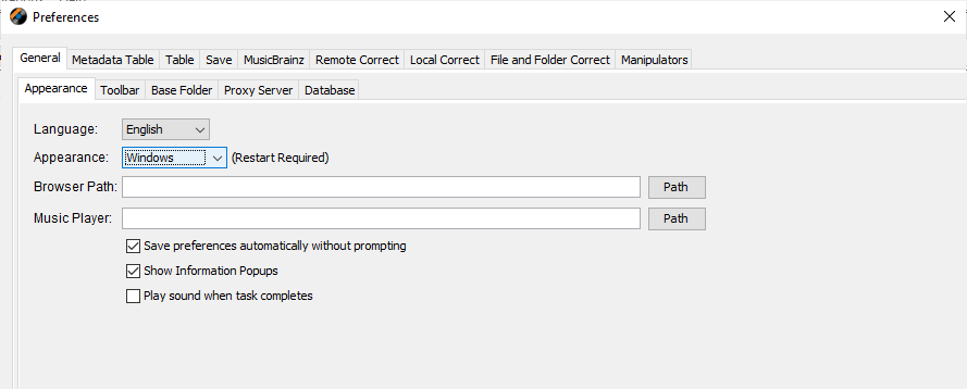
Yes, on Windows/Linux you already can with the Appearance option, but you just have a choice of Windows or Cross-Platform on Windows and Plastic or Cross-Platform for Linux

For Mac we don’t have this option instead it swaps between Dark/Light (Aqua) based on settings in MacOS Appearance menu (but not if you change MacOS Appearance when Jaikoz already running)

Just been looking at Safari web-browser on MacOS and this seems very similar when using Light or Dark, i.e the Light mode looks more like the current Jaikoz Dark mode (except for colours) than the current Jaikoz Aqua look, so I am erring towards using FatLaf for both modes.

1 Like

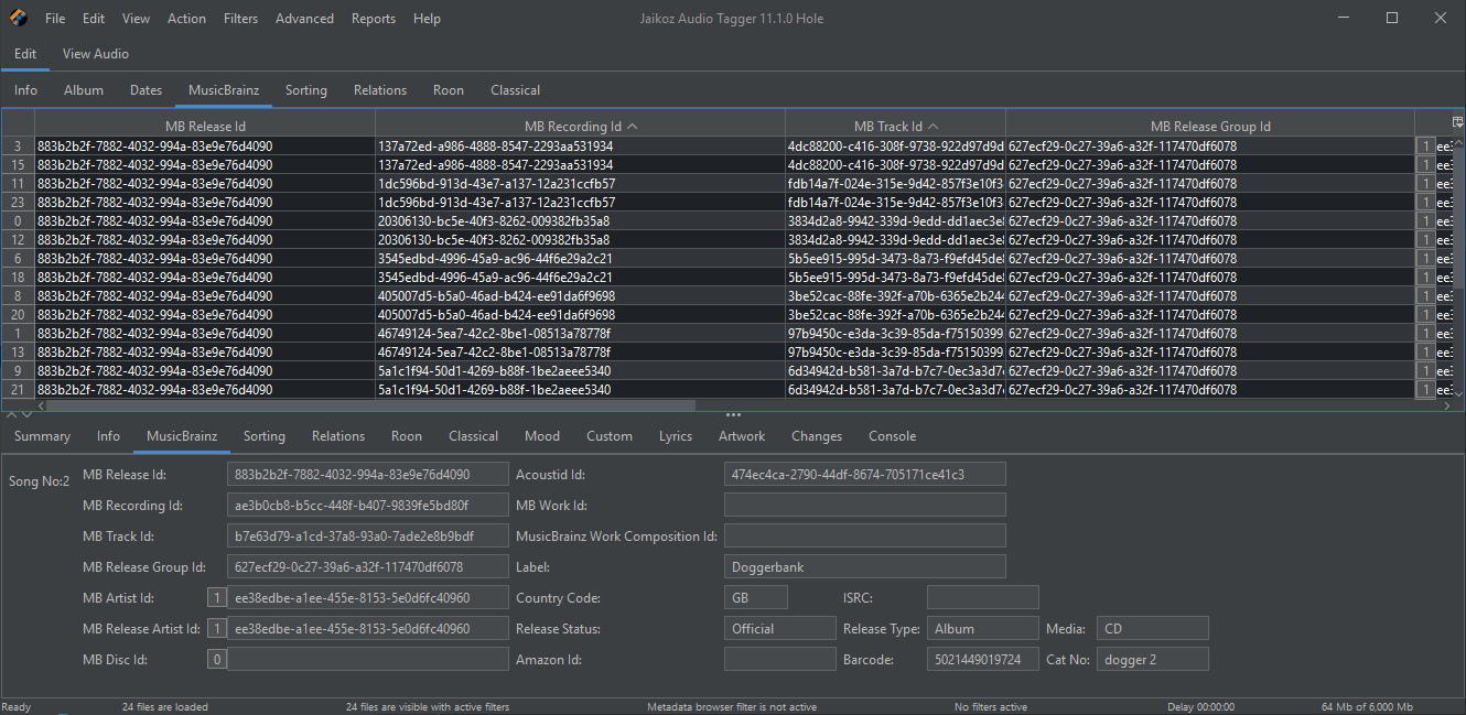
Working on Dark Mode for Windows, what do you think ?
Should we have stripes for main table or just gridlines ?

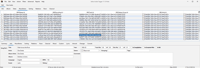
and this is light version

I think I like the lighter version better. On the dark version, is it possible to make the letters a brighter white?

It is technically possible, but the white is not chosen by me it is the white that the FlatLaf developer has chosen to best match the standard Dark look and they have more experience with this then me, so I think for at least first release I would like to keep to the default.

ahhh…ok :slight_smile:

Have now had this new modern look as part of Jaikoz 11.2.0 Swans

2 Likes