Hello. Icons looking a lot tidier since the old days – thanks!
I’m sure that (for Apple at least) HIGs suggest that the ‘Start’ button should in this case have an ellipsis, as something else happens before the actual start command is executed (in this case in the next dialogue). The ellipse shows people that there are subsidiary actions to follow and the actual process isn’t immediately instigated. I use the program only rarely and always forget where all the settings are, understanding that the indicated ‘Start’ button rolls the process. Sheer frustration let me to just start the damned thing and lo! all the options I wanted appeared post-actual-starting. This wasn’t expected behaviour. Thanks!
Ellipsis please?
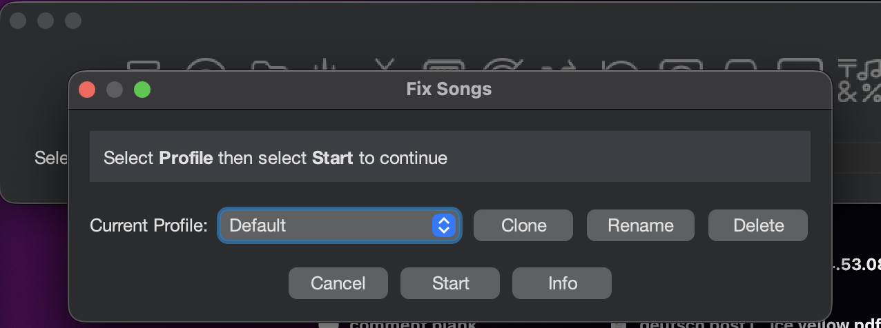
Hi, I see your point - I wonder if instead of Start I should use another word?