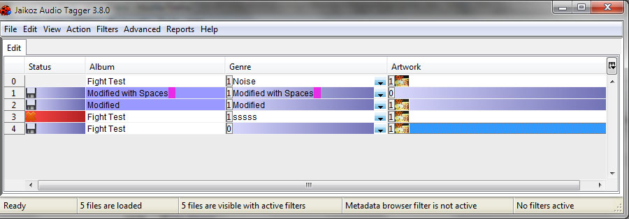
Been working on making Jaikoz prettier today, what do you think (the Album column is showing the current/old look) ?
Been working on making Jaikoz prettier today
Ill prefer function before look 
Ive always concentrated on functionality over look, but alot of people have said ‘Jaikoz is Ugly’, its seems to be the no 1 issue, so I think it merits a bit of development effort.
If a program does what I need, the last thing I’m worried about is whether it looks pretty enough.
I like to spend my programming time making my own software work as well as it can - rather than making it look pretty for people.
Surely you use software because it does what you need - not the colour of the GUI?
TenBaz
I think alot of people look at what a piece of software looks like first, and only if it is pleasing to the eye do they then delve further to see if it can do what they want it to do.
Yeap spreading to masses needs redesign of GUI, see Windows
Colors are good, they speedup orientation in changes, bugs +1 to colors. But gradient looks weird Paul.
Ill suggest to GUI redesign to be more accessible. We talked so much about it Paul. Buttons with toolbar with CTRL+… ALT+… SHIFT+… to do same thing but only different to ALL/ALBUM/TRACK … modifiers.
Right click button simplify menu … deeper levels of remote correcting make me crazy
Do you have any tool which measure how people clicks ? What is most used function ? Paths to desired actions ? I think this should be good to start point how to start redesign. Or simple survey form
I definitely say yes, make Jaikoz prettier and accessible.
Improve the toolbar, improve the icons. Use AA text on all platforms, choose a good font for everything. Allow people to change the toolbar, with pictures + text if they want. Good tool tips.
Just a few points; and don’t listen to feedback on individual items, design it as a whole and present it too the world.
Also change all the toolbar icons, make sure they are the right size for all platforms, for example the main icons are big on the mac but the search and left right arrows are small.
be very very very careful with colors. people like me who are color deficient (aka color blind) can find excessive use of color difficult to work with.
I understand the idea that people want the program to be “pretty”, but to be honest, I don’t think your concentration on the UI should be in regards to colors being used.
I think there are other areas of the UI that can be much improved before you start futzing with colors.
[quote=Anonymous]be very very very careful with colors. people like me who are color deficient (aka color blind) can find excessive use of color difficult to work with.
I understand the idea that people want the program to be “pretty”, but to be honest, I don’t think your concentration on the UI should be in regards to colors being used.
I think there are other areas of the UI that can be much improved before you start futzing with colors.[/quote]
that post was me…
[quote=Anonymous]Improve the toolbar, improve the icons. Use AA text on all platforms, choose a good font for everything. Allow people to change the toolbar, with pictures + text if they want. Good tool tips.
Just a few points; and don’t listen to feedback on individual items, design it as a whole and present it too the world.[/quote]
+1 to everything this person said.
Perhaps a move to something cross-platform and with better windowing like QT?
Some of these comments are very useful but I wonder a bit if you’ve misunderstood what I was trying to show in the screenshot.
Wrt to colours, highlighting changes in colours is in the existing Jaikoz preferences/Table/Synchronisation/Highlight changes in different colours)
but its disabled by default on OSX mainly because it is a bit garish, so I was trying out the gradient effect to make it look a bit more sophisticated (in my mind). So I’m not increasing the use of colour just making it look a bit nice (at least my mind), if you are colour blind or just don’t like the colours you can already set the colours that are used in Preferences/Table/Display.
Secondly Ive changed the status column so that it shows an icon rather than a single letter , which is clearer especially when using Jaikoz with non english translation.
QT is a no go for me I don’t know in what way you think it has better Windowing, but the things Ive seen it used for look horrible. I don’t see the need for different toolsets, just attention to detail to whats already done.
The toolbar icons is a good example of this, having the main square icons a different size to the left/right arrows doesn’t bother me, I cant see the problem, but if it bothers you then maybe I should change it.
Hmm, I havent a clue what a good font would be, I thought the fonts were anti-aliased on everything now
Configuration of the toolbar is certainly a popular request, whats holding me back from this is that trying to design icons for everything is a huge job.
I’ll have to revisit this, but it might mean losing some items as the menu will be massive if I drop from three to two levels.
I’ll did out the post, we did talk about it but I dont think I followed it that well at the time.
In the current version I really have no clue about the current item selection (green/gray/single-cell/multi-cell). Sometimes it processes just a few and sometimes it does all items.
Perhaps make some full-row colorization.
And an option to keep the current selection after some operations (copy/paste). Now when I want to use the cursor keys, it scrolls the table. And then I have to grab the mouse again and click a field.
Configuration of the toolbar is certainly a popular request, whats holding me back from this is that trying to design icons for everything is a huge job.
If that’s the case, then send it out to the masses. (Let your user’s design icon sets for you.) Just specify what you want:
- Icon Name
- Description (so the artists know what to design)
- Dimensions (Pixel Height/Width)
I’ll bet you get at least a dozen icon sets back. Dedicated users love to contribute and this would give them the chance.
Before I chose Jaikoz, I looked at many programs. First impression of Jaikoz was quite negative because of the looks, but the feature set was promising so I spend some time to evaluate it. If it were among the first programs I had looked, I propably would not have started even evaluating. Wow, I was lucky.
I’ve been using Jaikoz now for over a year, and I’m very happy.
To be honest, Jaikoz is ugly. But it works extremely well once you understand it. It is not very intuitive either.
I can’t tough imagine people who listen to music survive without it. Also the support is world class. It’s just about impossible to get bug fix on business software, but with Jaikoz you usually get them incredibly fast.
But, the looks. Earlier points were good. Perhaps you could engage a enthousiastic student/volunteer to help with design. In addition to improving the looks, you can improve the usability and intuitivity quite easily.
I suggest you look at Adobe Lightroom. It has quite logical workflow thinking and very good UI layout that could potentially be used with Jaikoz as well. I at least use Jaikoz through a standard workflow with clear specs how to fix tags and build and maintain my library.
At some point of time, you could also make the website little more attractive for new potential users.
I think you should also increase prices, this sweetie is pretty affordable for the value. Perhaps reduce features for the basic version with current pricing, and introduce a pro edition with all the bells and whistles for 49? or 59?.
Sailor
I’m running JaikozPro 5.11 on linux/64 (Opensuse 12.2 + KDE 4.10).
The fonts used/displayed are too small/grainy for my tired old eyes.
In a naive attempt to remedy that, being a java app (swing? dunno yet …), I modified jaikoz.sh to invoke:
where the additional
is what I use, successfully, to get other Java apps (e.g., Eclipse) to use my System fonts.
Unfortuantely, it seems to make no difference :-/
What, if anything, is the right/available method for convincing Jaikoz to use System fonts?